It’s a bit tucked away, but did you know you can easily change the layout of Salesforce pages? And this can be configured by each user?
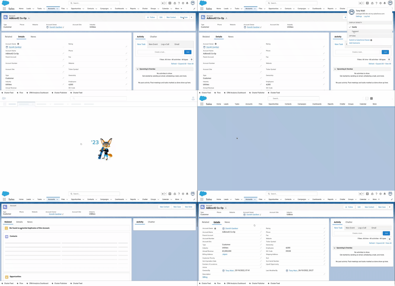
Salesforce allows users to select a Comfy or Compact view of pages.
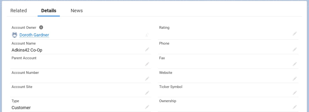
The Comfy view has more white space on the screen and field values are below field labels.
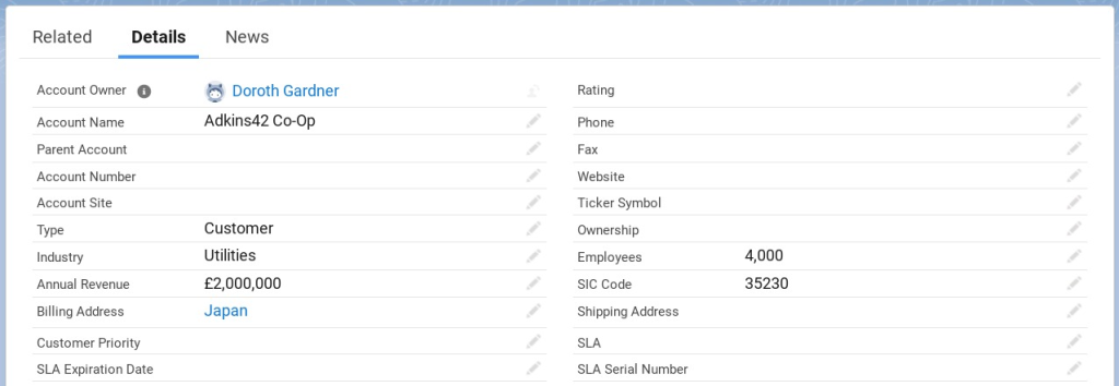
The Compact view is just that, compact and tighter. There is less white space on your page real estate. And field values are to the right of field labels.
How Do I Switch Between Comfy And Compact?
It’s very simple to switch between the two layouts. Simply:
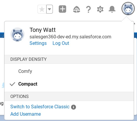
- Click on your profile icon (top-right corner of every Salesforce page
- From the pop-up menu, below DISPLAY DENSITY select either Comfy or Compact – see below.
It’s really that easy. Let your users know about this simple option and they’ll feel a lot more in control.
Salesforce Classic used a display density that was much more like the Salesforce Lighting Compact view. Any users who pine for Salesforce Classic can use a Compact view to remind themselves of the old days.




Leave a Reply