


One of the simplest and most effective functions of Excel is Conditional Formatting. Data can become much more easily understood in a few clicks.
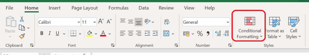
What is conditional formatting? It’s when a user defines their criteria and the cell values change colour to make the data come alive. It can be found here in Excel – Home > Styles:
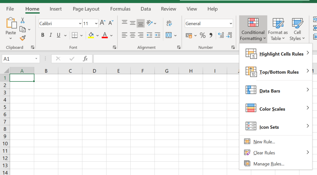
Once the menu is expanded it opens up a whole host of fab options.
The option I use the most and is the simplest to use is Highlight Cells Rules > Duplicate Values (see below). Simply select your range of data then click on Duplicate Values and any values that are duplicated will be highlighted in red.

Main Features
There are lost of options available for conditionally formatting your data. The options I used the most and would suggest you investigate further are:
- Text that contains – if you want to highlight certain text in your data range then try this option.
- Top 10 – this allows you to highlight data that is in the Top 10, Top 10%, Above Average. And it also works the other way if you want to highlight the bottom ten data points, bottom 10% of values or below average fugure.
- Data Bars are a great way to create lots of small bar charts using your data. this looks great on print outs to paper or PDF.
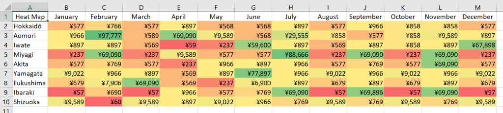
- Heatmaps – always popular with consumers of data, a heatmap demonstrates the variety of your data in a couple of clicks, see below.
- Icon Sets – give your data Red/Amber/Green status right away, or give your data values a star rating depending on your requirements.
Create Your Own Rules
What is incredibly powerful with Conditional Formatting is the ability to create your own rules so you can change the appearance of your data using the specific criteria you need. See below the range of options available – have a play around.
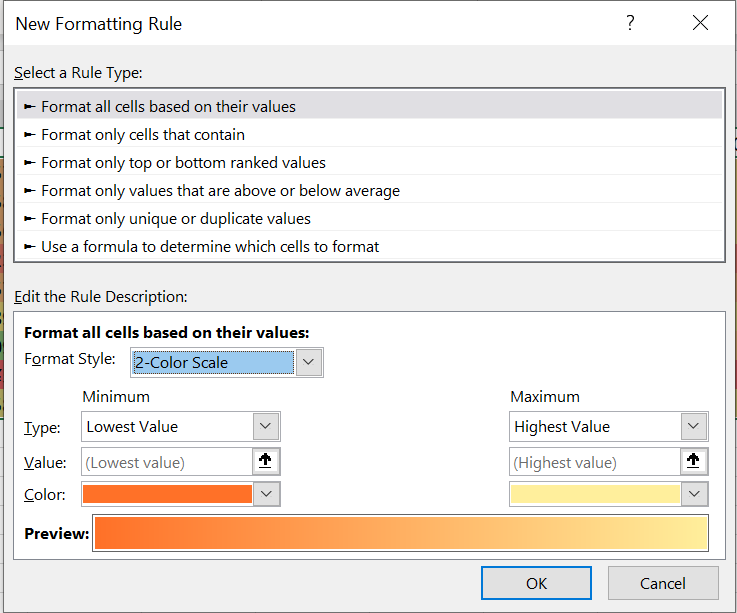
You can also save these rules in the Manage Rules section so you can reuse them in different parts of your spreadhseet.
Heatmaps
Heatmaps are a great way to quickly highlight the most important data in a range. To create a heatmap you need select your data range and then select Conditional Formatting > Color Scales. Choose the colour options that best suit what you’re trying to demonstrate with your data.
Remove Conditional Formatting
To remove any Conditional Formatting simply select your data again and select Clear Rules. And there’s also the option to Clear Rules for the Entire Spreadsheet in one go.
Conclusion
Have a play around with Conditional Formatting and see what it can do to make your data more insightful. Any viewers of your spreadsheet will be impressed by how meaningful the data becomes with Conditional Formatting.
I’ve put a few examples below in a spreadsheet for readers to download and try out.
Leave a Reply